The Oneiric Visions of Erica Calardo

In the contemporary art landscape, few artists manage to bridge the gap between the rigorous precision of mathematical logic and the ethereal, often haunting beauty of figurative painting. Erica Calardo, an Italian artist based in the historic heart of Bologna, achieves this with a mastery that feels both timeless and profoundly modern. Her recent viewing room at 33 Contemporary on Artsy offers a captivating window into her "oneiric" world—a realm where the solitude of lost souls meets the grandeur of the Italian Renaissance.

From Logic to Linen: The Artist’s Evolution

Erica Calardo’s path to the easel is as unconventional as her subjects. Born in Genoa in 1980, she spent a decade as an academic researcher, holding a PhD in mathematical logic. This background in the abstract and the structured informs the underlying clarity and symbolic depth of her work. Today, her atelier in Bologna—surrounded by ancient stones, warm colors, and the mysteries of old masters—serves as the crucible for her visions.

Calardo is largely self-taught, having honed her skills through "old dusty books" before studying under the renowned Italian master Roberto Ferri. Her technique is deeply rooted in the Italian tradition, drawing inspiration from Mannerist and Renaissance icons such as Leonardo da Vinci, Bronzino, and Lavinia Fontana.

The Aesthetic of the "Oneiric" Feminine

Calardo’s paintings are characterized by what she describes as "oneiric feminine figures." These are not merely portraits; they are windows into a timeless past, telling tales of forgotten dreams and the "solitude of lost souls." Her work explores the delicate intersection of:

  • Beauty and the Grotesque: Finding grace in the unsettling and the eerie.

  • Magic and Mystery: Infusing figurative realism with a sense of the supernatural.

  • Solitude: Capturing the quiet, introspective moments of her subjects.

Her palette often reflects the "warm colors" of Bologna, yet her subjects frequently inhabit dark, atmospheric spaces that evoke the "memento mori" of the Victorian age and the haunting atmosphere of ghost stories.

Erica Calardo

Magdalena, 2021

Oil on linen

40 × 27 1/2 in | 101.6 × 69.9 cm

A Dialogue with the Past

One of the most striking aspects of Calardo’s work is her ability to engage in a dialogue with art history. Her portraits of Leonora Carrington, Remedios Varo, and Frida Kahlo are not just likenesses; they are acts of artistic lineage. By painting these women, Calardo situates herself within a tradition of female surrealists and figurative painters who used the human form to explore the depths of the psyche.

Her work Suspirium (2020) and Magdalena (2021) further demonstrate her ability to take classical themes—the breath of life, the penitent figure—and imbue them with a contemporary, slightly punk-rock edge. This fusion of the baroque and the rebellious is what makes her work so distinctive in the current figurative scene.

Conclusion: Living in a Dream

For Erica Calardo, being an artist is "like living every day in a dream." This sentiment is palpable in every brushstroke of the works featured in the 33 Contemporary viewing room. Whether she is exploring the "solitude of lost souls" or paying homage to the giants of art history, Calardo invites the viewer to step out of time and into a world of magic, logic, and profound beauty.

To explore these works further and experience the oneiric visions of Erica Calardo, visit the 33 Contemporary viewing room on Artsy.

"When I’m painting I feel connected to my deepest nature. There is only me, my easel, my visions. The colours, the soft brushes, the scent of walnut oil." — Erica Calardo

Erica Calardo

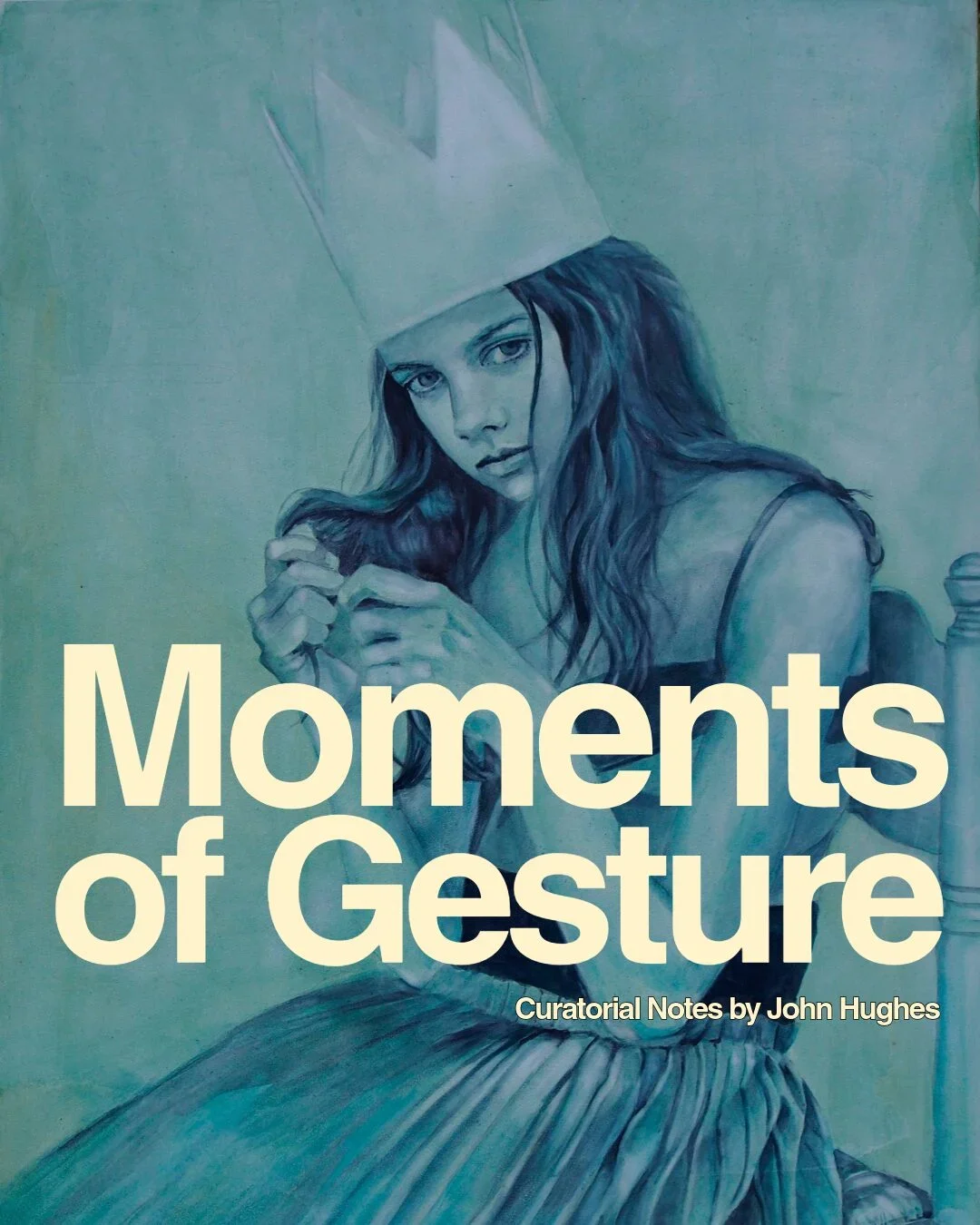
Moments of Gesture | Nanette Fluhr

Notes on Nanette Fluhr by John Hughes

Nanette Fluhr

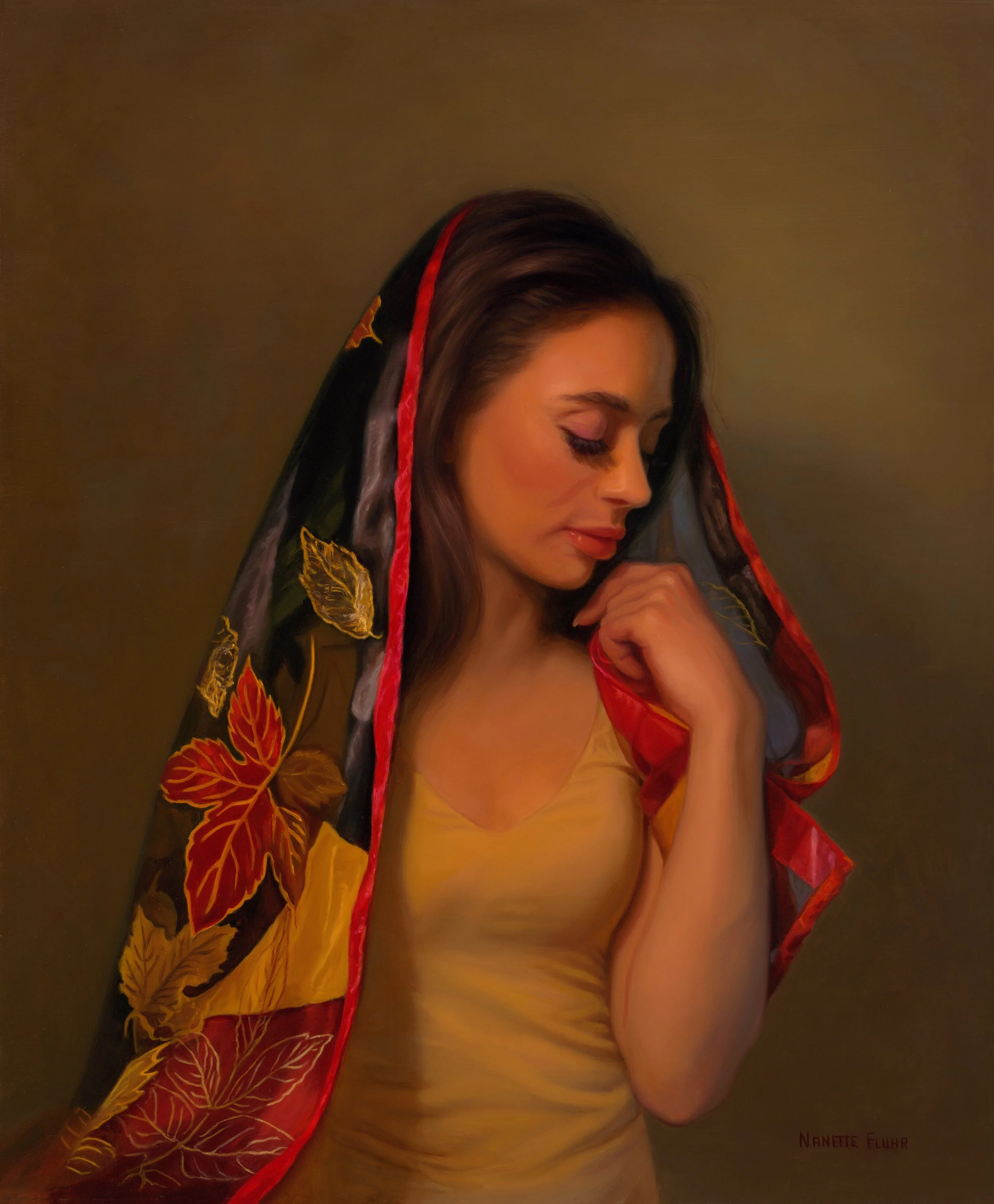
Autumn, 2022

Oil on masonite board

21 4/5 × 18 in | 55.4 × 45.7 cm

Frame included

In Autumn, Nanette Fluhr stages a lush threshold. The medium—oil on masonite—supports a saturation of color that feels less applied than emanated. The tones gather in a kind of dusk-light, warm and interior, as if illumination were arising from within the surface rather than falling upon it.

The drapery over the figure’s head offers a quiet allegory. Its autumnal leaves, in deep reds, ochres, and golds, unfold against a ground of black. Yet this black does not register as darkness in any oppressive sense. It does not foreclose the image. Instead, it deepens it. The leaves do not fall into shadow; they seem to be carried by it, held within it.

The woman’s posture—head inclined, eyes closed—withdraws from outward address. She is not presented for the viewer, but turned inward, as if receiving something. The gesture is contemplative, performative as such. While the figure is beautiful, the painting resists eroticization. Beauty here is not offered but absorbed. The viewer joins sympathetically in a gesture of spiritual inwardness.

Light as always is of the essence. The background glows softly, without a defined source, allowing the figure to emerge gradually rather than sharply. This diffusion creates a gentle oscillation of attention: the eye settles on the figure, drifts outward, then returns. The space feels less like a setting than a field of presence.

What the painting ultimately proposes is a reversal. Autumn, conventionally aligned with decline or loss, becomes here a moment of arrival. Not an approach to desolation, but an entry into fullness. The season does not empty; it gathers. The figure appears not at the edge of disappearance, but within a completed state—an immanence that is neither anticipatory nor retrospective. This is gesture in the moment, suspended as the moment's endurance.

Nanette Fluhr

Ascending, 2023

Oil on canvas

52 × 33 in | 132.1 × 83.8 cm

In Ascending, Nanette Fluhr presents a woman suspended in water, reaching upward in a state of quiet composure. The signs of submersion are delicately rendered: the drift of her clothing, the particulate shimmer of light, small bubbles gathering near her feet, the green-blue atmosphere, the steady presence of water lilies. Near the top, the surface flickers—light fractures into a trembling plane of reflection. Her hair billows gently. She is dressed in white, but the garment is unbinding rather than restrictive. The figure is not sexualized; the gaze is not directed that way. Instead, the painting situates us within a field of experience.

The realism is persuasive. The painterly handling of fabric, light, and suspension activates bodily memory—you feel the slowed physics of water, its resistance, its hush. The cues are subtle but cumulative. The viewer is drawn into an environment that is immersive without being overstated, tender without becoming indulgent.

Yet the painting never relinquishes its identity as paint. Particularly at the upper threshold, the surface breaks into more gestural, abstract strokes. The illusion thins. What reads as the surface of the water is also the surface of the canvas asserting itself. The eye shifts—from depiction into material. Paint incarnates into form, yet remains irreducibly paint.

This produces a structural divide within the image. Below: suspension, interiority, a dreamlike calm—almost pre-verbal, even womb-like. Above: flicker, disturbance, a threshold—of emergence, or perhaps of perception itself.

Her upward reach can be read as ascension, but also as contact with a limit. She reaches not only toward light, but toward the point where representation begins to fail—where the image discloses its making. This limit is staged within the painting. It implies a beyond, unbounded, luminous, yet the painting itself is bounded, held within its frame. The work thus enacts a recursion: a limit that contains its own beyond. In this sense, it becomes a metaphor for freedom within materiality.

The body is not eroticized. This absence is not neutral; it reorients the figure. She is not an object of vision but a subject of experience. Desire is not eliminated but transformed: it reappears as the desire to float, to rise, to release. The loose white garment reinforces this condition. What we witness is not a body posed, but a being passing through a state. The calm is not passivity so much as consent—an openness to transformation. Consent to something freeing not subduing.

The painting operates across three interwoven registers: narrative image (a woman ascending through water), embodied sensation (buoyancy, quiet, suspension), and material awareness (paint as paint, surface as surface). These layers do not resolve into unity but remain in productive tension. That tension resists sentimentality. It reminds us that the image is constructed, mediated, made.

The ascension, then, is not only hers. It belongs equally to the painting itself: a movement between illusion and its own facture, its facticity—those moments where the surface curls back into gesture, where paint declares its presence within the very scene it sustains.


Nanette Fluhr is an internationally recognized portrait artist whose work bridges classical technique with contemporary realism. Her work has been exhibited internationally, including at the European Museum of Modern Art in Barcelona and in a six-museum tour across China. Her portraits hang in courthouses and institutions nationwide, and her painting has been sold at Sotheby's.

After graduating from Rutgers University, she earned her BFA with honors from the School of Visual Arts, where she trained under John Frederick Murray, and later at his atelier. She served as a registered copyist at the Metropolitan Museum of Art, creating master copies of works by Rembrandt, Rubens, Van Dyck, Velázquez, Lawrence, and Vigée Le Brun.

She is the recipient of the Distinguished Achievement Award for Portraiture from American Women Artists and the HerStory Award from Manhattan Arts International. Her work is permanently archived in the Lunar Codex aboard NASA-partnered missions to the moon, making her among the first women artists to have work preserved beyond Earth.

More Notes on Moments of Gesture

Notes on Moments of Gesture
by John Hughes

Nadia Ferrante

Finally I love myself, 2026

White pastel, green pastel, charcoal on cotton paper tonalized with cadmium red

17 × 30 in | 43.2 × 76.2 cm

The work of many serious painters today—those we might loosely call representational or figurative—is aligned by their common bobbing in the same moment of the day. Alive at the same time, they inevitably survey the same interconnected cultural scenery, the same mortal and existential anxieties, and they seek similar solaces through the unique craft that is making art.

The poet Wallace Stevens once said of poetry that “it must give pleasure,” and that is one criterion here as well. Yes—simple, hedonistic pleasure: the aesthetic appreciation of something too often dismissed or mistrusted, what we call Beauty. We see this first at the most immediate level—in the colors and forms present in these works. The quality of the work one observes when looking up the artists’ names is, in one sense, overwhelming, and in another sense not.

As I confided to Didi after a first perusal: “My gosh, these are serious workers.” The obsession, the diligence, the pursuit of the art—the craft both technical and emotive—is evident everywhere. One can tangibly see how figurative realism has absorbed the lessons of photography, cinema, existential thought, psychology, and hyperrealism. All of these cultural forces are sublimated into the elemental gesture of the brushstroke as it walks the line between intention and something more Delphic—something given.

When I observe one of these paintings—say, a portrait of a face, or a study of the way light passes through a glass marble—it can feel as if the whole of contemporary consciousness is faintly implied within it. These artworks carry an awareness of the observer that is particular to our time. They have absorbed the lessons of abstraction. They are not traditional in any simple sense, yet they clearly derive from very traditional lineages. One can sound very high-minded, even philosophical, writing about these paintings. But one could also say more bluntly: in their various genres and modes, they bring pleasure.

They have no problem being as beautiful or compelling as a page from Vogue or a magazine cover. Yet they move beyond that surface appeal precisely because the abstract mechanics of paint—pigment itself, whether oil, pastel, chalk, crayon, or pen—can at any moment pierce through the illusion of representation and assert itself.

If we look at paintings such as those by Nadia Ferrante, the imagery is clearly inflected by the surrounding culture. The poses feel cinematic, almost photographic. Yet more fundamentally they are crafted out of pigment, manually, by hand and eye. In that sense the painting becomes a reclamation by the organic of the technological. Likewise, in the expressions of the faces, we can faintly detect the traces of personality—each “who they are.” Each time that implied personality leaps forth as unmistakably contemporary, belonging to the present moment.

Even the lines of a face carry the history of countless micro-expressions, sensitive reactions formed within the very situation we ourselves inhabit: the shared condition of being alive together.

Patricia Schappler

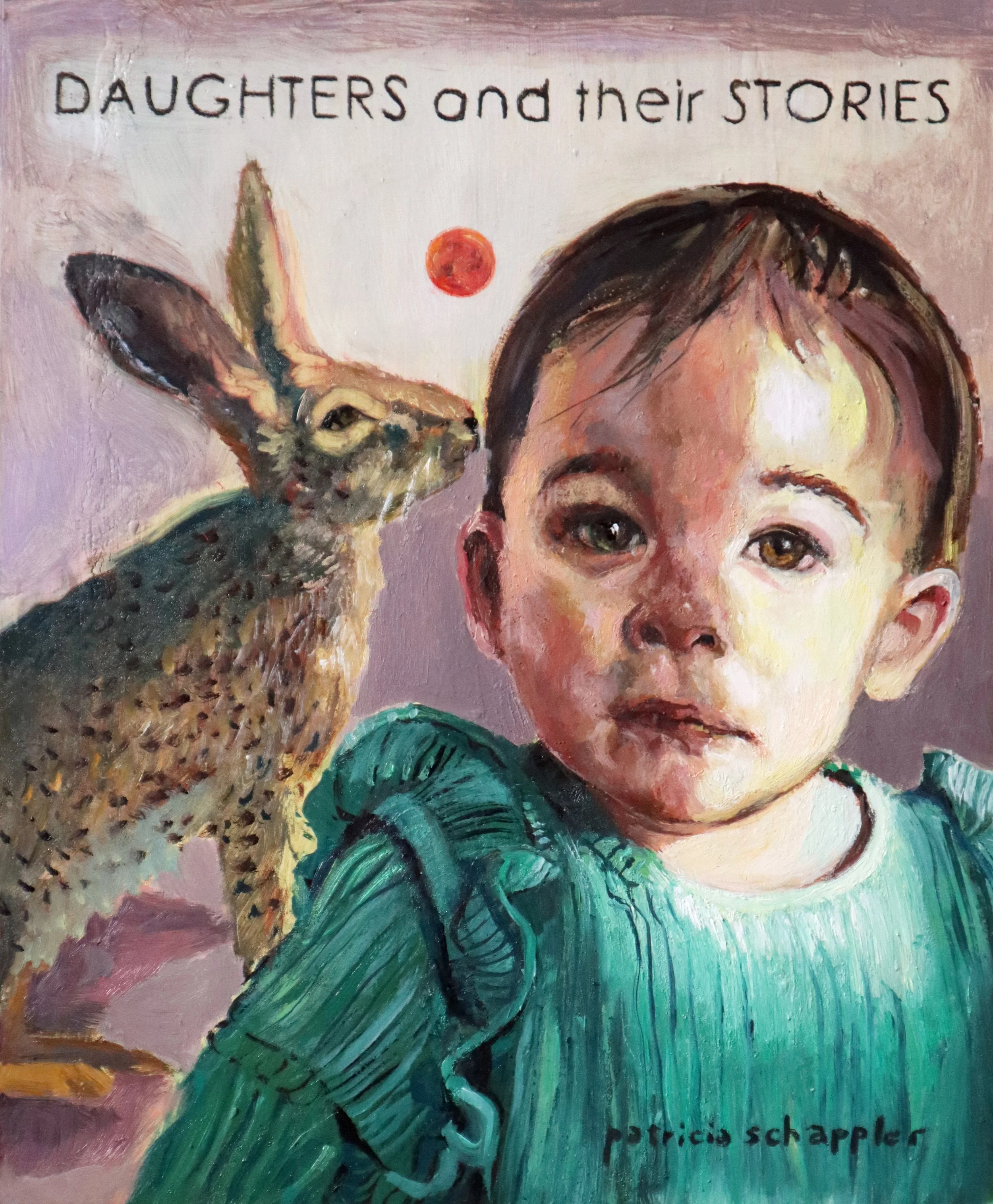
Daughters and their Stories, 2026

Oil on board

9 3/4 × 8 in | 24.8 × 20.3 cm

A similar phenomenon appears in paintings such as those by Patricia Schappler. In the expressions of the faces there is something ineffably contemporary. We recognize these people almost unconsciously. That recognition exists entirely because of how the painter has made the face. This is craft in the service of art. It is the art of the possible, even as it hints at transcendence—or immanence (and what is the difference?).

The people are rendered in a style that understands how viewers today live amid a steady diet of media, photographs, images, and shifting valences of light and color. Through the craft of the painter, all of these visual languages are imported, reconstituted, and returned to us. In that process, the painting answers the curiosity of the viewer—their capacity to respond, to feel, to be alive. Good painting calls to life.

Is it a Photograph? Curated by Jan Anders Nelson

I surveyed this group with the question, “What is the relationship of a photograph to your work?”

The artists represented in this exhibit all use photographs in the creation of their works.  None of them see duplication of a photo as a goal, but as a starting point, a sketch, a reference, a layout tool, a moment in time, a part of a storyboard etc., though the relationship between artist and photograph is unique in each case.

Any artist who works in a technically tight discipline is capable of creating imagery that can be mistaken at a glance for photographs.  When a viewer comments “Wow! That looks like a photo to me!” the intent is usually a positive one, complimenting the artist on their technical skills. Several of the artists here expressed that they are happy to accept that enthusiasm as a compliment, and hope that the initial engagement leads to a deeper connection to the viewer’s relationship with the work, at times reaching an awareness of the intent of the artist or of feeling a personal connection to the art.

I could delve into the use of photography as a tool by artists, the long history of layout aids, and about whether use of a camera is cheating or lazy and the increasing role of photo manipulation tools like Photoshop as a key part of an artist’s process.  I could talk about the rise of AI in making artworks, leveraging the millions of images that live on the Internet and keying in phrases to compose works.  But these are topics that others have covered in great depth, or in the case of AI created art, a topic of emerging interest needing more time to evaluate.  I am leaving all that to others, my intent with this exhibit is focused on how these seven artists view their relationships with photography, and value their own processes.  And, in the end, I will comment a bit about my own relationship with photographs in my work.

Jan Anders Nelson

October 14, 2022

Gig Harbor, Washington


ELIZABETH BARDEN

Elizabeth Barden

Jaya-ism, 2019

Oil on linen

14 × 11 in | 35.6 × 27.9 cm

Elizabeth Barden is an Australian artist focused firmly on figurative art and the narrative. In her words, “Through my paintings I can tell visual stories of people, to highlight uniqueness and strengths as we seek ways to understand ourselves, and our communities.”

“I am attracted to the strength of personality I see in Elizabeth’s portraits, they transcend technical transcription of the topography of faces and moments.

JAYAJa-yah/ proper noun–derived from Sanskrit, meaning Victory. ISMizm–noun-a distinctive practice system, or philosophy, typically a political ideology oran artistic movement.

Jaya Suartika is an Adelaide based artist. My subject’s skin is almost entirely covered in tattoos, only his face is devoid of ink. Jaya says initially he chose to get tattoos because of the punk side of it, anti-establishment. He was in the punk scene and it was a kind of ‘fuck you’ to the norm. His attitude has changed now, and his inked skin has evolved into aesthetic recognition and personalized ornaments.

If I have to wear a label, it is 'Contemporary Figurative Artist', and my work inhabits the genre of Realism. I regard myself as a storyteller.

I am an Australian artist, living in the beautiful Cairns, Far North Queensland.
I’m often painting people who live far away. Although I always travel to have live sittings, it essential for me to take photos as on-going reference to use in my studio.
If another artist had the opportunity to paint from my reference photos, I can absolutely assert that their result would be greatly different to mine. I do not rely upon a single image, and each artist brings their own vision to their work. My reference photos also play a vital role in permitting me to intimately examine certain elements, without compromising my comfort or that of my sitter. Portraying another human is a somewhat voyeuristic undertaking, and that is accompanied by a trust and responsibility.

I am not a hyperrealist. In representing my subject, I curate the human qualities that I wish to bring to the fore, and I employ various art and design principles accordingly. I hope when I paint someone I can inject a feeling that goes beyond skill or technique, beyond outward appearance to what lies within. I seek to learn from observation, to represent in visual simplicity an emotional complexity - a hint of the inner self in a sincere and sensitive portrayal. I seek to celebrate identity.

There are viewers who believe they are awarding you a supreme compliment by saying ‘it looks just like a photograph’. I understand they are taking the time to express an appreciation, perhaps focusing only on the skill, and I accept the honest sentiment.

My artist heart beats faster when a viewer grasps the deeper meanings and complex emotions hidden in plain sight, and they respond in a way that shows they understand, truly understand the subtleties. My work is never aspiring to mimic a photograph, my paintings are layers and layers of brushstrokes intentionally placed to build a sense of the time, place and person - their story and perhaps a little of mine.”


VICTOR GADINO

Victor Gadino

Taking Back The B Word, 2021

Oil on linen

30 × 24 in | 76.2 × 61 cm

Victor is a classically trained artist who holds an MFA from Pratt Institute. His work spans illustrations for movie posters, album covers, posters for Broadway plays.  It is this illustration background that pops for me in his painting “Taking Back the B Word”.  The message conveyed in this work is quite clear with the interplay of the graffiti and the subject of the title in an expression that seems to be telling the viewer to step back, that she is in charge of her life.  While it may not be politically charged by intent (I did not discuss this with Victor), the feeling it invokes in me is certainly aligned with contemporary events and how strong women are cast as bitches by men in power who fear losing their control.

“Like many artists who paint and draw realistically, I rely on photos as my main reference. But my goal is never for a painting or drawing to actually look like it’s a photograph. Unlike hyperrealists who render every hair or pore on a person’s face, I like the sense that the artist’s eye, hand and emotion played a part in the creation of the image. I’m not trying to trick the eye of someone into thinking they are looking at a photograph.

I learned years ago; when I was creating art for movie posters and using movie stills that the studios supplied; that what appears real in a photo isn’t necessarily correct or pleasing to look at. The artist's eye has to pick and choose elements that fit their aesthetic goal.

My process is this: I research an idea, scribble a sketch and make notes, find or hire a model and have a photoshoot, manipulate the photos in photoshop (a great deal) and create a digital image that matches the vision in my head. The finished image may look photographic but it doesn't exist except on my computer. That is what I then use as my reference . Then when I’m drawing or painting I allow brush strokes or pencil lines to be visible so that the trained eye knows it’s not photograph.”


MARIAH KAMINSKY

Mariah Kaminsky

Her Resolve, 2022

Oil on canvas

20 × 16 in | 50.8 × 40.6 cm

A graduate of Ball State University’s Design/Technical Theater program, Mariah’s work as a scenic artist at playhouses in Indiana and Maine developed her skill for artistic detail. This training is evident to me in the dramatic poses in her art, that speak to me of strong emotion in the artist about her subjects.  While she says she is focused on joy or simple pleasures in life, and her subjects reflections of “positivity, optimism and resilience; the themes that she finds the most urgency to highlight in today’s turbulent society”, in “Her Resolve” there is a more pensive moment depicted.  I asked Mariah about this work and its meaning for her.

“She represents a quiet resolve in myself... I was quite depressed & feeling very stuck when I began this series. The energy of this painting and the act of painting it did indeed help me out of my dark space.”

I asked Mariah, if a viewer comments "it looks like a photo!", are you satisfied with that level of engagement?

“Honestly, I would rather they say, "It looks so real!" But I think maybe most people believe they are one in the same.

I use photographs to capture the specific pose or expression that I am looking for in the model. I then use those images as reference for the painting. I design the painting entirely in Photoshop and then have that image on a screen beside the painting while I work. I do try to be as photorealistic as possible while keeping a "painted" quality to the final piece.”


GWEN MANFRIN

Gwen Manfrin

It was only when she Closed her Eyes, that she Could See the Stars, 2022

Graphite on paper

24 × 18 in | 61 × 45.7 cm

Graduating from the University of California, Los Angeles with a B.A. in Fine Art, Gwen has a focus on what she refers to as both sensory and metaphoric, saying “For me, the figure provokes an immediate response, a subliminal messaging through body language and attitude.”  It is her observation of people as they move through their lives that teases out these moments that reveal an inner sense.  In “It was only when she closed her eyes that she could see the stars” I found myself attracted to the possibility of a young person who needs to close out the external noise and pressures of her life in order to find her dreams.  It is a feeling that is familiar to me.

“I am inspired by emotion.  This particular piece gave me the opportunity to explore a very passive expression.  The security of her placing her hands on each cheek giving her comfort in the moment.  And even with closed eyes, I could feel a strong emotion. One that says, “ I am released to see so much in this moment, the forever starry skies, the peace of my heart, the serenity of my life. My gaze sees the stars and the endless possibilities of my dreams and wishes.”

The gentleness of her hair and satin dress , her quiet pose all make room for this quiet emotion.  I felt peace during the creation of this work and still do when I look at it.

I use photography in a few ways. I often shoot my own subjects, while in conversation with me.

This necessitates me getting to know my model so that I can recognize a true emotion.  (Thank goodness for digital!, I can take a lot of images).  Then i spend time with the images and the perfect expression/body language will become readily apparent. 

I did a selfie series, recently. I am not fond of selfies and was amazed when I saw a person spending, all by herself, taking what must have been 500 shots of herself,(and while standing in a beautiful environment). All that mattered to her was getting that perfect shots to post…..when I started digging into the internet, I would find 100 of pics of the same person.  So, it was like having a model to shoot, except my perception of this person was really the sitter’s own perception.  That was interesting and enlightening.

So now, I use a combination of the two.  I sometimes take my own images and I sometimes search for an image and try to find more of that same person , to help me understand their motivation.  The final artwork can be a combination of many images.

Since I am looking for a chance encounter, the use of photography helps me to capture that moment.  If the model were sitting for me to draw or paint, I would lose the spontaneity of a quickly glimpsed moment.”


LISA RICKARD

Lisa Rickard

Callisto, 2019

Oil

14 × 14 in | 35.6 × 35.6 cm

Focused on the nude, Lisa is classically trained, earning her BFA in Graphic Design from the Milwaukee Institute of Art & Design and studied drawing and painting at Temple University Tyler School of Art.  Her time as a dancer and dance instructor has strengthened her insights into the power of the human form and feels like it guides her work creating what she refers to as a series of allegories in her paintings.  

In “Callisto”, I am attracted to her use of chiaroscuro to create a dramatic scene depicting an individual in quiet repose.  The lighting is quite striking as it reveals the subject, the composition reminiscent of thinking “mise-en-scène” from my days in theatre.

“Callisto is the second painting in a series of allegorical figures about three stages of life: youth, adolescence and adulthood. Callisto represents the adventurous adolescent reflecting the most fascinating moon with the same name. Callisto is the only one of Jupiter’s 79 moons that scientists believe may have an underground ocean. And if it does, Callisto may have a chance at supporting life.I am always thinking about finding and revealing on paper or canvas the beautiful stories hidden in the simple gestures made by the nude human form.

As a nude allegorical figure painter, I am inspired by the gestures of the nude human form for creating timeless and universal stories. Having been a dancer, dance teacher and drawn/painted from live nude artist models that were dancers, I am inspired by the beautiful design of the human body. I develop my ideas for paintings and now use photography as a tool to help me interpret the mental picture that I see in my imagination. The figure always represents an allegorical story in my paintings - something as simple as adolescence to more complicated stories such as the melding together of opposite states of mind. The photograph reminds me of how light flows over human form in real life. I think about the light flow while I’m painting with photographic reference material and how the hue, value and chroma of my paint swatches from my pre-mixed color strings on my palette will be applied to the linen surface to visually create a feeling of three dimensional form to ultimately illustrate an inspirational allegorical concept represented by the figure and any additional elements in my composition.”


DAGGI WALLACE

Born and raised in Berlin, Germany, currently living near Los Angeles, CA, Daggi is a self-taught painter specializing in contemporary figurative realism and portraiture.  I was initially attracted to Daggi’s use of pastel and charcoal as primary painting mediums, and thinking of the works as paintings.  My own work with these tools felt like drawings to me, the differences in attitude being an area to think about more.

I found the two paintings “Joshua” and “Pamela” from Daggi’s series “We All Bleed Red” to be important as a set, a diptych of expression that is just a part of the larger series of 16 portraits in the series.  Daggi invited me to look at her notes about each subject to check in with my own initial reactions to them and see where I landed compared to the stories of the individuals.  Putting my own perspectives and biases on the line is a powerful force to confront honestly.

“Joshua is a devoted single dad of a toddler son living in Wyoming. Most of his many tattoos are inspired by the world of Disney.

Born and raised in Sacramento, CA to Chinese immigrant parents, Pamela is a former runway and print model for clients ranging from Target to Tiffany and everywhere in between (IMagnin, Neiman Marcus, Saks Fifth Ave, Oscar De La Renta, Givenchy, Donna Karen, David Hayes, Giorgio Armani, Chanel to name a few.) She was also a TV and theater actress and after earning her Master of Fine Arts’ Degree from the Art Center College of Design in Pasadena Pamela is now an award winning contemporary painter blending Asian historical graphic subjects with abstract art.”

For me photography is a tool as well as inspiration to create my images. While I view drawing and painting from life as a necessary practice to hone my skills, practice is the main word there because I don't think I have ever framed and displayed a piece that was done from life. They simply don't meet my own standards of the detail and realism I like to achieve in my work. Photography gives me the gift of time and space: enough time to contemplate the poses, lighting and story I want to tell through them and enough space away from the model where I can focus completely on the painting process and not worry about the model's comfort level. By nature I'm an introvert even though I have learned to hide it well, an observer of people who has not found a way to interact with my subjects, talk to them, tune into their moods and form a connection with them while at the same time focusing on the actual act of drawing or painting.

I get nervous before a photo shoot, mainly because I worry about making my model feel comfortable in front of the camera (many are not professional models), something I struggle with myself. But usually once we get started the creative collaboration between us begins to flow and we have a blast. Also, I prefer capturing emotional moments in my work, sometimes intense and fleeting ones that are just not possible to capture during a live sitting.

After the shoot I am then able to take all the time I want perusing the resulting photos and choosing which ones will end up as paintings. I absolutely love going through hundreds of pictures, noticing which ones immediately give me that physical reaction, the goose bumps, the butterflies, the hair standing up. Those are the ones that get me excited to go into the studio and start planning the resulting paintings. Sometimes I go through photos again months or even years later and it's always interesting how my reaction may have changed by then. The ones that sparked an initial response may now leave me cold while others may move to the forefront of possible new work and could even result in new ideas that were not part of the original photo session. 

Most importantly, having the solitude and time to view all of the photos for as long as I want creates space in my mind to listen to the muse's direction, how I want to interpret a given photo, what things I might add to it or leave off, what color scheme I want to employ. Often, titles present themselves very quickly, too, but none of this works for me if I'm still in the room with the model worrying about whether they are hot or cold, bored or tired, feeling like I have to make conversation which would then make it impossible for me to hear that inner voice of intuition.

The quiet detachment that photography affords me is vital to my working process of connecting to my thoughts and intentions without any outside distractions. Often, the photo shoot and subsequent viewing and planning take much longer than the actual painting process!

Once I have tuned into my ideas and plans I can then take my time executing them to the best of my ability no matter how long it may take. The technical aspects are made easier because the light remains constant, I can zoom in on details, change things such as composition, background, texture, even color and contrast to some extent, all without needing another sitting with the model. I can even play around with using the same reference pics with a variety of styles, techniques and materials resulting in very different images. This is vital for my artistic growth as I enjoy experimenting marrying realism with abstract components. Photography as reference is the best tool for me and my personality to achieve my objectives.

On another very different note, working from photographs also allows me to work with commission clients or models who are not in my area or are no longer living (I have done quite a few commissioned posthumous portraits). While I find this difficult and prefer taking the reference photos myself so I can meet the person and get a better understanding of their personality, body language and coloring it is nonetheless a useful tool that allows for more options.”


DOUG WEBB

Doug Webb

Moving On, 2021

Acrylic on linen

20 × 16 in | 50.8 × 40.6 cm

Doug, who considers himself a “classic, romantic surrealist” emigrated from Istanbul, Turkey at a young age, to California.  Self-taught, Doug has a special relationship with the work of Rene Magritte and references that interest frequently in his subject matter through the use of what he refers to as “the recognition of opposites” and of contradictory scale of elements placed in the same composition.  I find his works to be fun and introspective with strong feelings of satire and irony as well as political or cultural commentary, at times about the duality of the pursuit of happiness while living in the rat race of conformity.  When I first encountered one of Doug’s works in person, I was a bit confounded by the excellent craftmanship of his art, the work being virtually inscrutable in process and asked him about how he achieves the extreme realism of the subject matter, a bit of irony in itself when looking at the surreal compositions he creates.  His work is in acrylic, composed of many layers of glazing over an underpainting.  And, while it is easy to be captivated by that technical skill, I am drawn to the metaphors he creates, such as the story he tells in “Moving On” of a boy growing up and leaving youth behind.  There is a familiar emotion for me in the imagery that rings true.

“This painting depicts a young boy saying goodbye to his faithful companion/Teddy Bear, as he begins his transition towards adulthood. It was inspired by New Testament Bible scripture, 1 Corinthians 13:11, which reads “When I was a child, I thought like a child, I reasoned like a child. When I became a man, I put the ways of childhood behind me”.

The photographic reference is vital to drawing the viewer in. It gives me all of the obsessive details I need to capture your attention and then hopefully the viewer will be touched by the message. The photo is the launching pad but not the destination. That’s when the surreal kicks in.


JAN ANDERS NELSON

Jan Anders Nelson | Kodachrome | 35cmx35cm, oil on canvas 2020 | Permanent collection of the Coupelouzos Family Art Museum in Athens

In “Kodachrome”, done in 2020, I took an introspective leap back in time to the mid-70s when I was almost exclusively using slide film.  The image is of the ubiquitous Kodachrome film packaging, a piece of litter I found next to my parking space around 1975, the irony of using that same film to record the moment not lost of me then or now.  While slide film is a thing of the past, and “Kodachrome” mostly remembered as a classic rock song, the exploration of the image grew out of my finally digitizing a fairly large collection of my slides I had been carrying around for decades.  That act forced me to look at them and started an internal dialog with that young artist from the 70s as if going back in a time machine.

I’ve always used my camera as my field notebook, a quick way to capture a moment in my life.  As I turned toward studio art from working in the theatre, those photographs became references both of time and place and compositional aides as I created my layouts.  Initially, I worked freehand, but found that use of a grid I created from a clear piece of acrylic gave me greater ability to focus on small areas within the reference.  The next step was to use an overhead projector as a method to quickly layout onto paper or canvas.  That led me to use of a slide projector (the subject of “Kodachrome”) and today a video projector.  The photographs themselves required work in the darkroom to get exposures dialed in, replaced today by Photoshop where I find myself guilty of “pixel peaking” when digging for deeper understanding of specific aspects of the work I am creating, using some of the features to adjust the image somewhat to express the memory of that moment from my perspective.